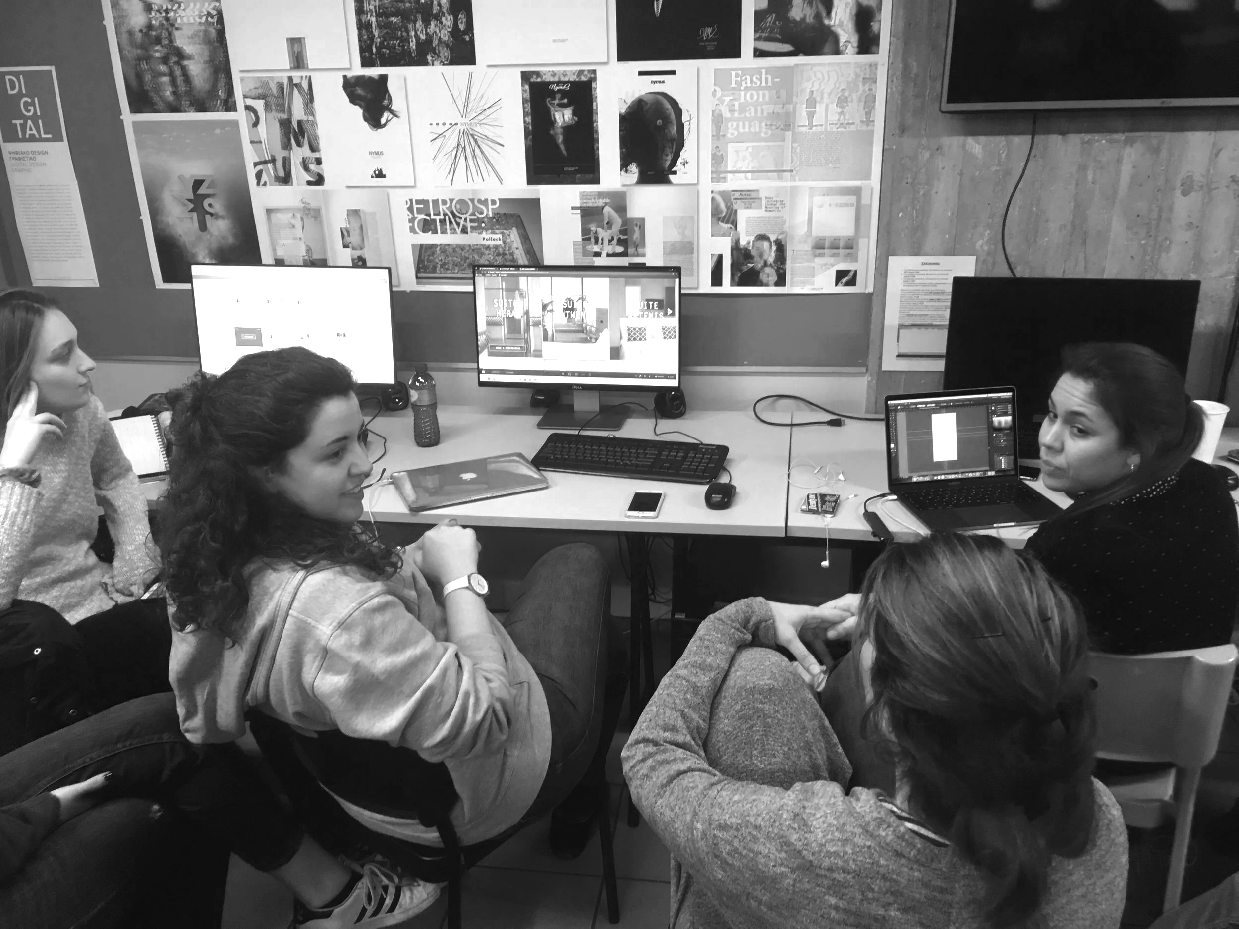
the student who already agrees with you
Every critique has one of these. You point out that the hierarchy is flat, that nothing on the page tells the eye where to land first, and before you finish the sentence they are nodding. Vigorously. "Yeah, no, totally, I knew that, I was actually going to fix that." They agreed with you before you had made an argument. This should feel like a win. It rarely does.
The first lesson I teach every year
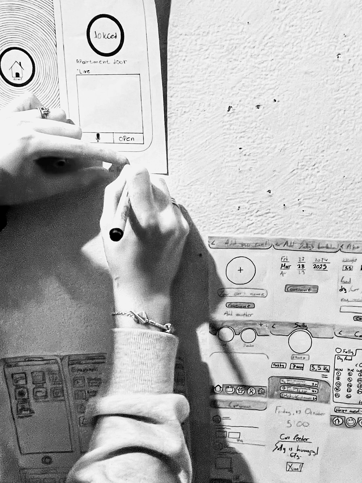
Every year, on the first day of the professional digital design course, I do not open Figma. I do not discuss wireframes. I will not show any slides. In addition, I handed everyone a piece of paper and a pen.
Then, I asked them to draw, from memory, in as much detail as they could, the app or website they used most. The home screen of their phone. Instagram. Their bank app. Google Maps. Whatever lives at the center of their digital day.
On the apology before the work
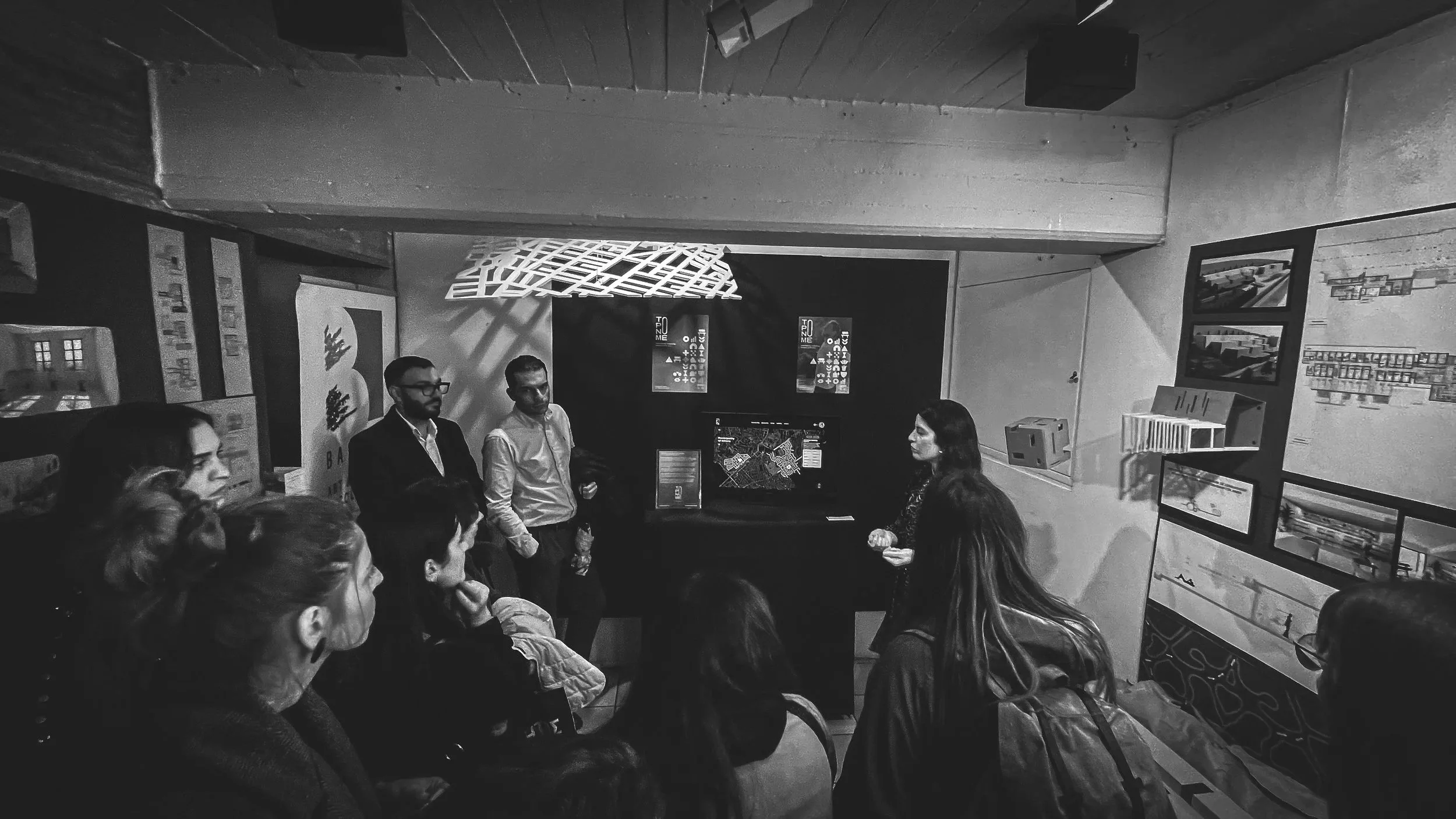
There is a sentence that precedes almost every student presentation, in some form, regardless of the assignment, the year, or how much time they had. It goes roughly like this: "So, I know this isn't finished, I ran out of time, I wanted to do more with the typography, but..." Then they present. Often the work is fine. Sometimes it is better than fine. Occasionally it is the best thing in the room, delivered with the confidence of someone reading their own eulogy.
The difference between clarity and simplicity
There is a tendency in design to equate simplicity with reduction. Fewer elements. Less content. Minimal interfaces. Remove enough, the thinking goes, and understanding will follow.
Sometimes it does. Often, it does not.
Simplicity is a visual outcome, clarity is a cognitive one. They are not the same, and mixing them can make work look thoughtful, but it won't work that way.
The MVP mindset
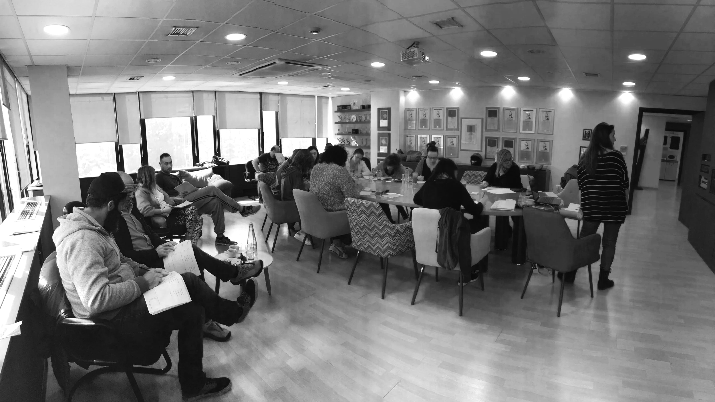
The most challenging aspect of my teaching is not design. It is letting go. However, the hardest room to teach is not a classroom. It is a boardroom. In the Digital Product Design workshop I facilitate, there is always a moment, usually around hour three, when someone realizes that their favorite feature is not essential. That is nice. Users might enjoy this. But that, without it, the product still works.
the silence after "any questions?"
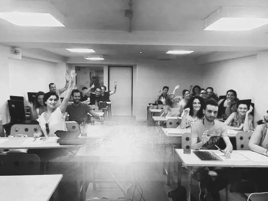
Every workshop has the same moment. The material is finished. The slides go dark. You ask if there are any questions, and the room does the thing rooms do. It looks somewhere else. At the table. At a laptop. At absolutely nothing, with the intense concentration of someone studying a very important nothing.
For years I assumed this meant the material had landed cleanly. No confusion, no questions, job done. I have since revised that theory considerably, mostly because I have also sat in that exact silence, on the other side, doing the exact same thing, once while the presenter was looking directly at me.